Asesor de Viaje
Year Archive · offline
Client Asesor de Viaje — asesordeviaje.com.py, Paraguay
Role Concept · UI/UX design · Illustration · Flash/ActionScript development
Stack Flash Fotografía a sangre Datos en vivo
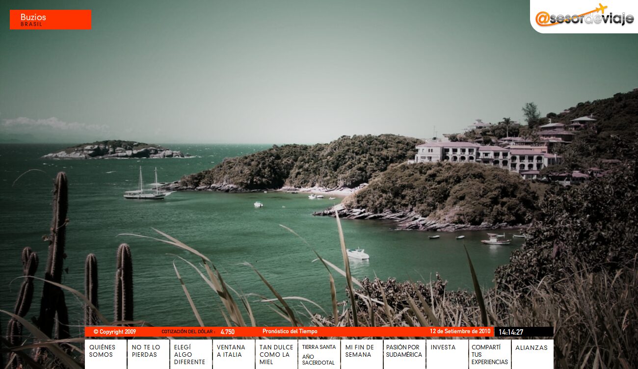
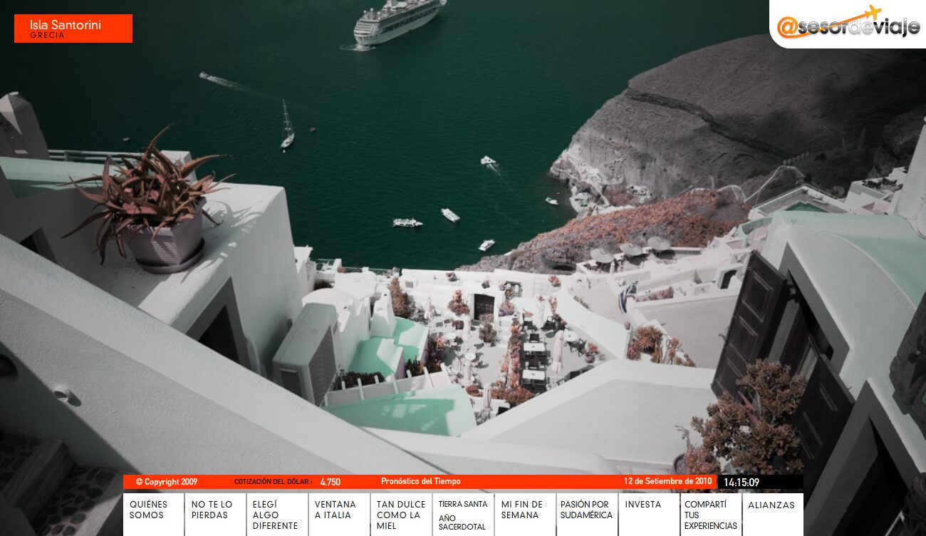
The whole screen is the place: a full-bleed photograph, no frames and no columns, with the name of the destination on an orange plate top left —Búzios, Brazil; Santorini, Greece—. Below, like a news ticker, the dollar rate, the weather forecast and the clock running.
Concept
A travel agency sells something the customer cannot try before paying for it. The purchase is not decided by reading an itinerary: it is decided when someone pictures themselves there. So I let the photograph of the destination fill the entire screen, no box, no margin and nothing on top of it but the name of the place.
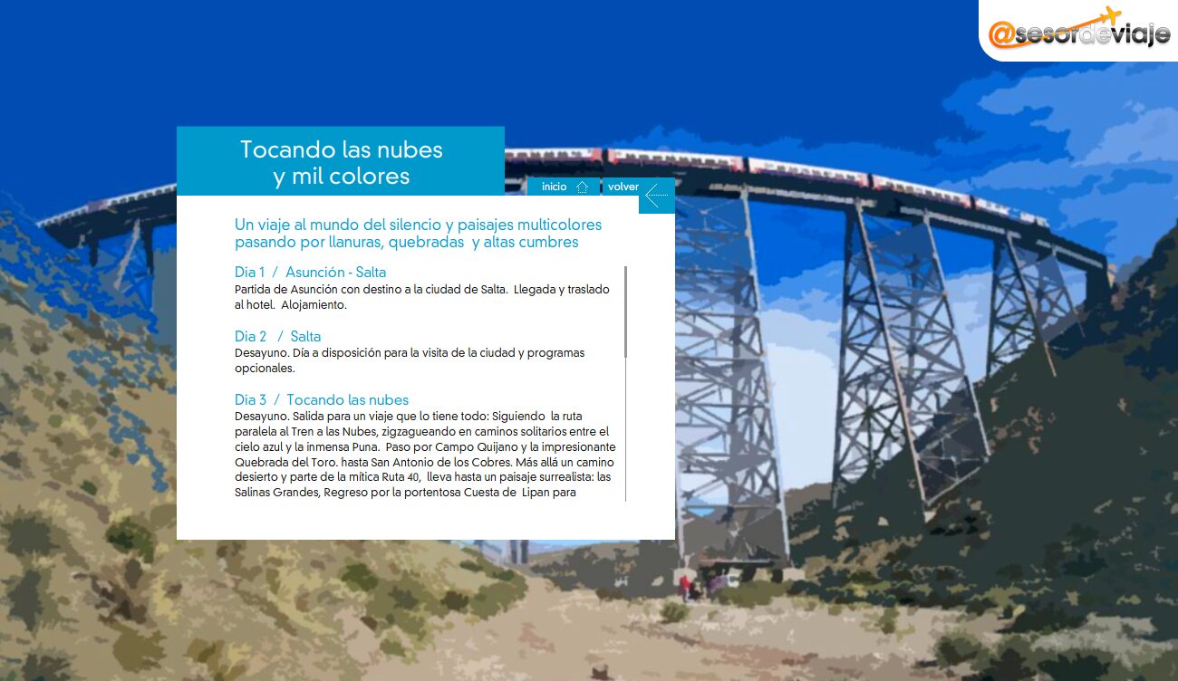
The menu is not organised by product either, but by desire: "as sweet as honey", "my weekend", "choose something different". Nobody goes looking for a seven-night package; they go looking for a honeymoon or a getaway. The itineraries do come down to earth, day by day, in a translucent panel over that same photograph: first they make you fall for it, then they show you the small print.
What I like most about this piece is not visual: along the bottom, like a news ticker, run the dollar rate, the weather forecast and the time, live. Those are the three things somebody checks the day before travelling, put where they do not have to be looked for.
Sections
-
01
About us
Institutional.
-
02
Not to be missed
Featured trips.
-
03
Choose something different
Off the usual circuit.
-
04
A window on Italy
Themed programme.
-
05
As sweet as honey
Honeymoons.
-
06
Holy Land – Year for Priests
Religious travel.
-
07
My weekend
Short getaways.
-
08
A passion for South America
The region.
-
09
Investa
Its own section.
-
10
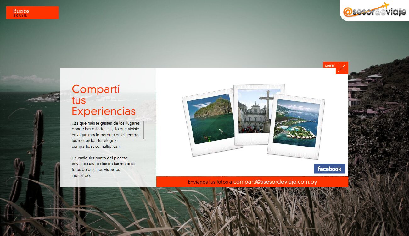
Share your experiences
Photographs sent in by customers.
-
11
Partners
Commercial partners.
Screens