Ganadera Sofía
Year Archive · offline
Client Ganadera Sofía S.A. — Luque, Paraguay
Role UI/UX design · Development
Stack Galerías paginadas Submenú por línea Catálogo en PDF Fondos a pantalla completa Fotografía propia
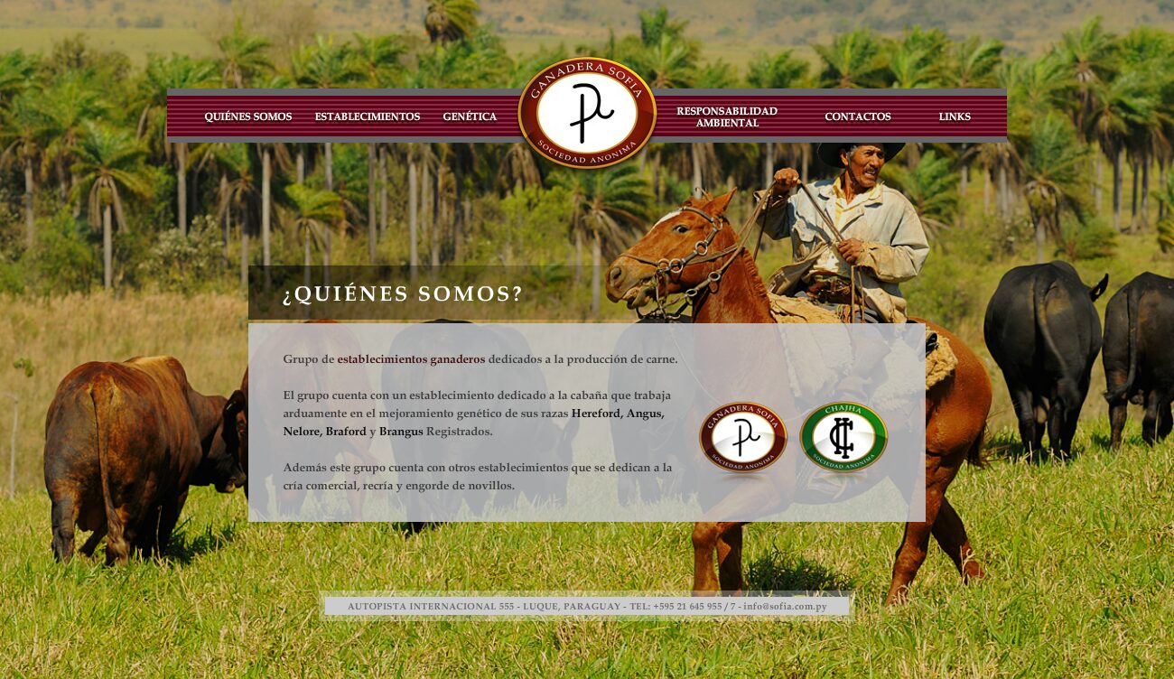
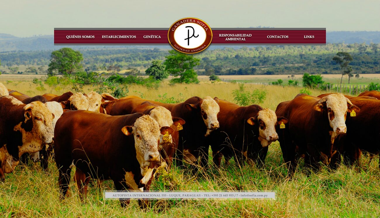
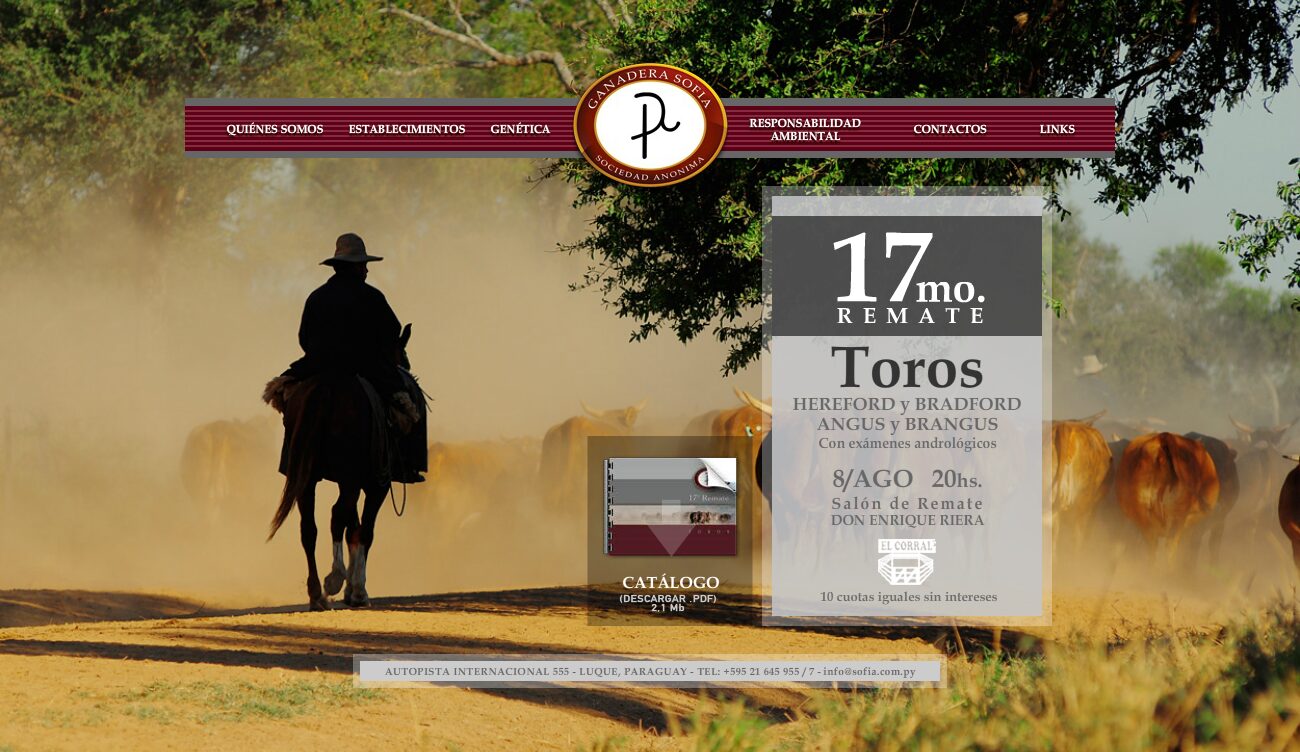
A cattle-breeding site without a single infographic: full-screen field photography —the herd in the dust, the golden grassland at sunset, the cattle between the fences— with the interface resting on top in semi-transparent panels. The field is the background, and the background is the argument.
Concept
A genetics operation does not sell beef to consumers: it sells breeding stock to other ranchers. And that buyer is demanding in a very concrete way — they want to know which ranch the animal comes from, from which bloodline, and in what conditions it was raised. Trust is built by showing the field. That is why the home page explains nothing: it puts up the photograph of the herd in the dust and, beside it, the only urgent thing — the auction, with breeds, date, financing and the catalogue as a PDF. An auction has a deadline; everything else can wait.
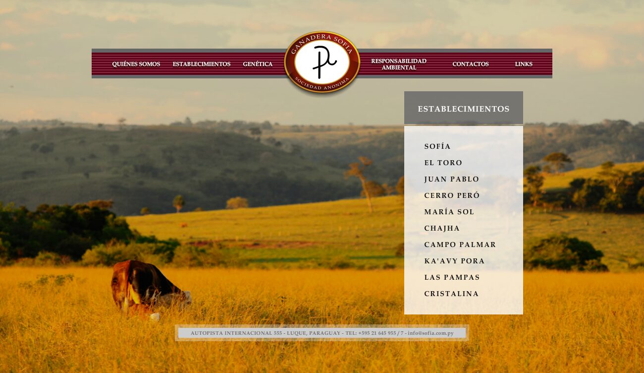
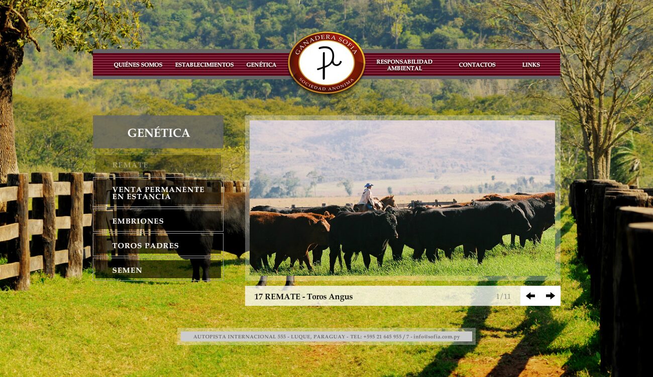
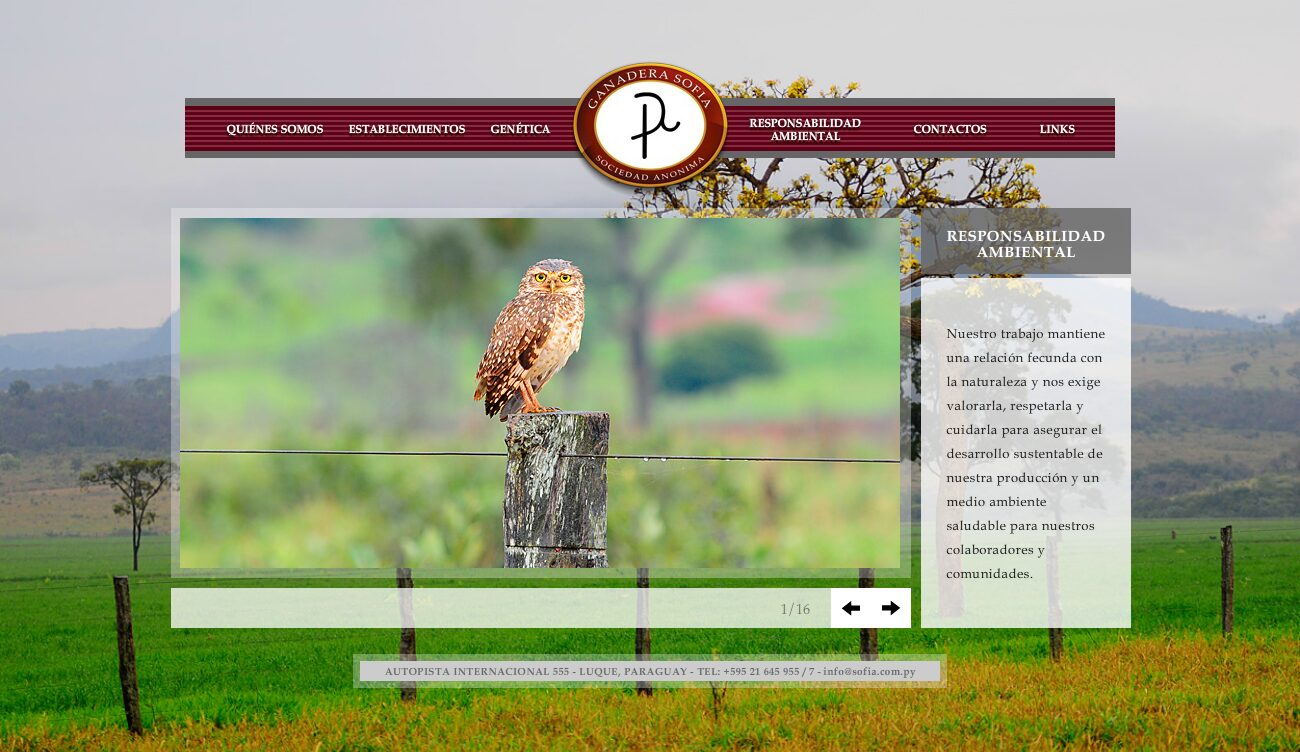
Ranches is the proof of scale: ten properties with names of their own, each with its own page. For a buyer, that list says more than any adjective. Genetics is the commercial heart and it is properly broken down —auction, permanent sale at the ranch, embryos, stud bulls and semen—, five different ways to buy bloodline, each with its own gallery: a cattle site that only talked about the auction would leave out the business of the rest of the year. And Environmental Responsibility, which on another site would be filler, here is an argument: sixteen photographs of wildlife from the company's own fields, for an activity questioned precisely over its relationship with the land.
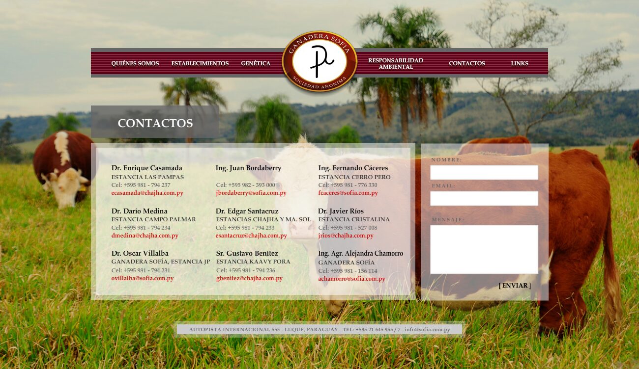
Full-bleed field photography, filling the screen and changing by section: the dust of the herd backlit, the yellow grassland with the bull lying down, the corral. None of it is generic: you can tell these are the client's own fields. On top of that, the interface floats in semi-transparent white panels, and the navigation is a burgundy band with the circular logo mounted on it like a wax seal on a ribbon. It is the perfect counterexample to Curupayty: there the brand is built with a drawn blueprint, here with documentary photography. Both are from the same period and they look nothing alike.
Sections
-
01
Home
Field photograph and the current auction, with the PDF catalogue.
-
02
About us
The company.
-
03
Ranches
The ten properties, each with its own page.
-
04
Genetics
Auction, permanent sale at the ranch, embryos, stud bulls and semen.
-
05
Environmental Responsibility
Wildlife gallery and text on sustainable development.
-
06
Contacts / Links
Details and links.
Screens