BYP Festival
Year Archive · offline
Client Budweiser and Palermo — BYP Festival, 21 September 2007
Role Concept · UI/UX design · Illustration · Flash/ActionScript development
Stack Flash Fotomontaje Galerías
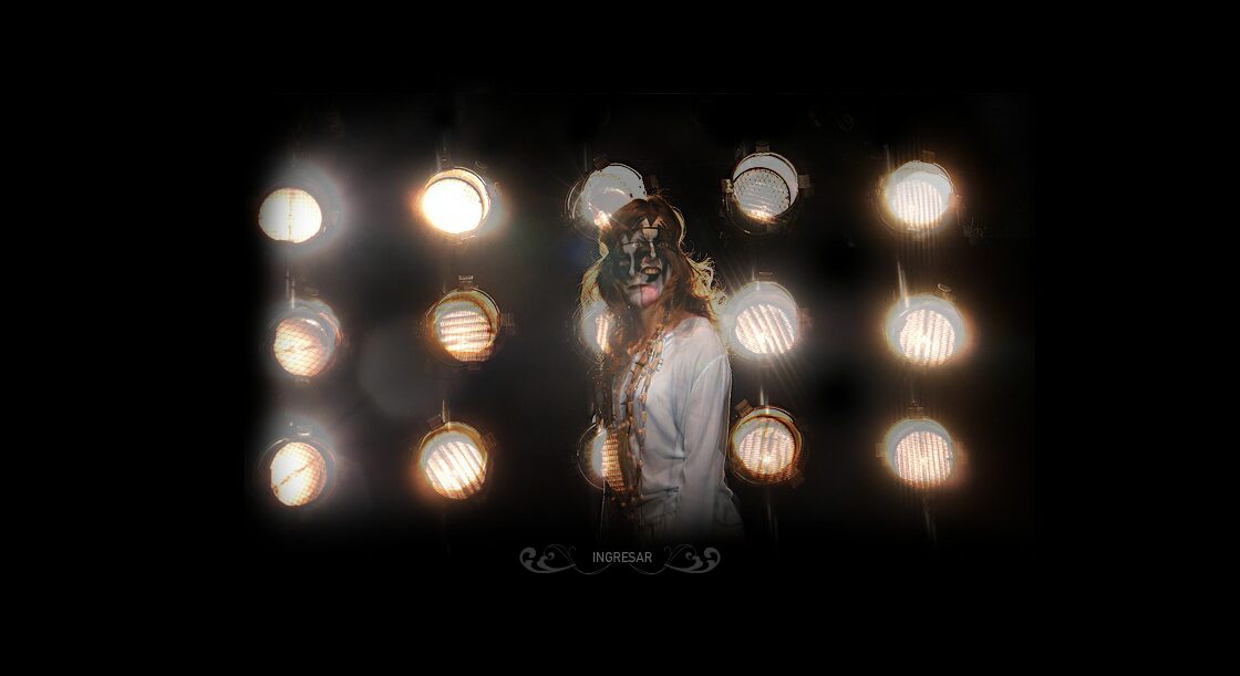
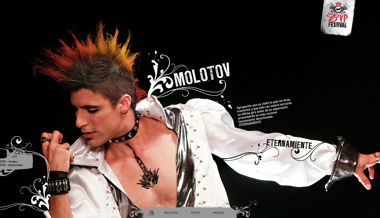
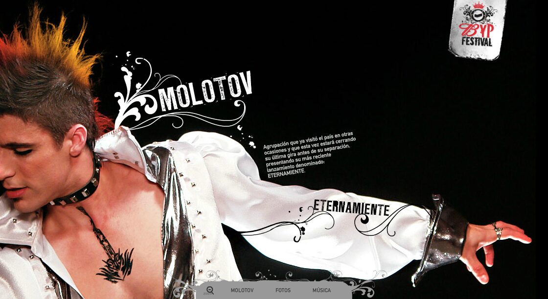
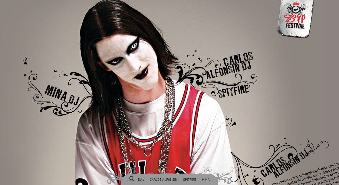
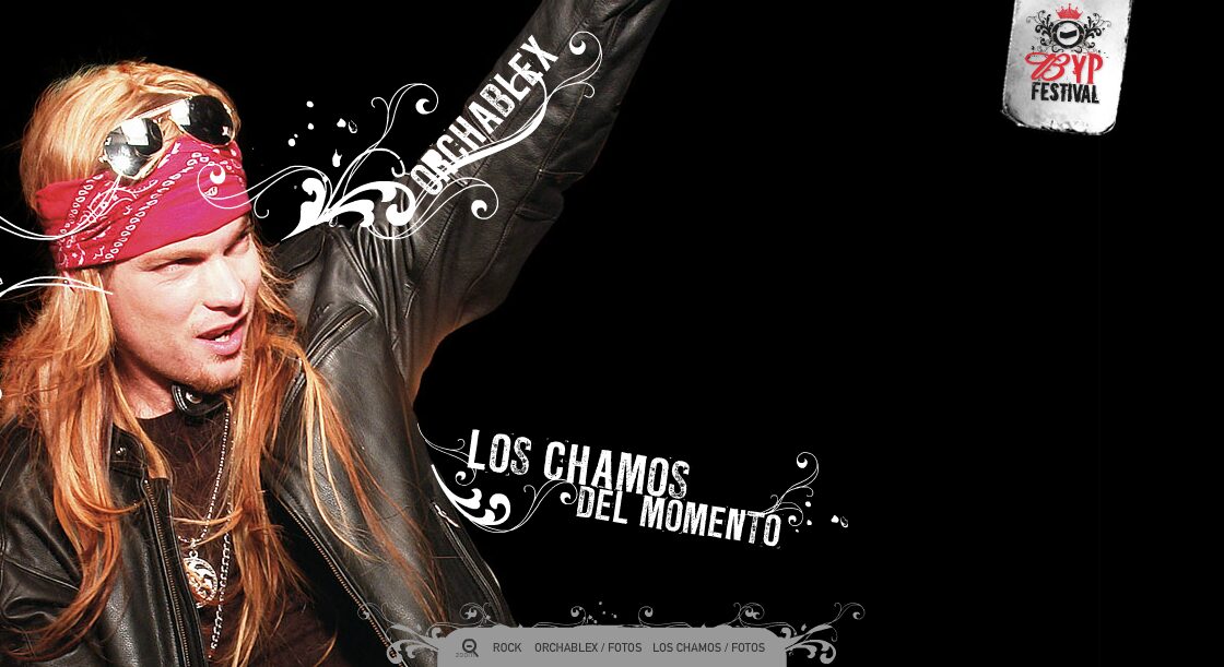
Absolute black, artists cut hard against the edge of the screen and a white filigree that grows out of them and writes their names. Top right, the festival logo hanging from a small metal plate. A festival site made the way the festival poster was made.
Concept
A one-day festival is sold twice: before, to fill the place, and afterwards, so people know what they missed. The site had to do both with the same material. BYP stands for Budweiser and Palermo, the two brands behind it, and the name is built to sound like VIP: hence the crown on the logo and the little metal tag it hangs from.
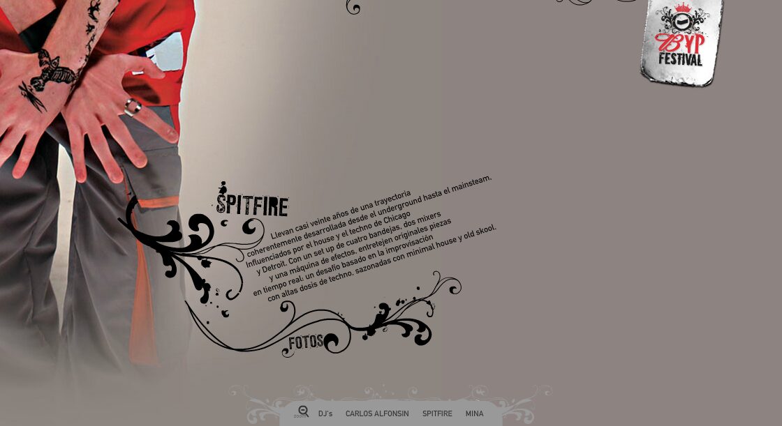
That is why there is no grid of identical little photographs: there is a full screen per artist, each with their photograph cut hard against the edge, their standfirst and their own submenu. Molotov, Mina, Orchablex, Los Chamos del Momento — every one of them feels like the headliner. After the festival those same screens filled up with photographs and video, which is what brings people back the following week.
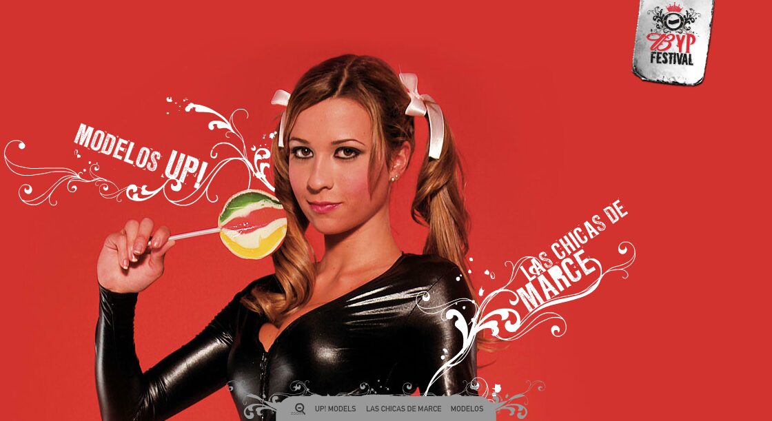
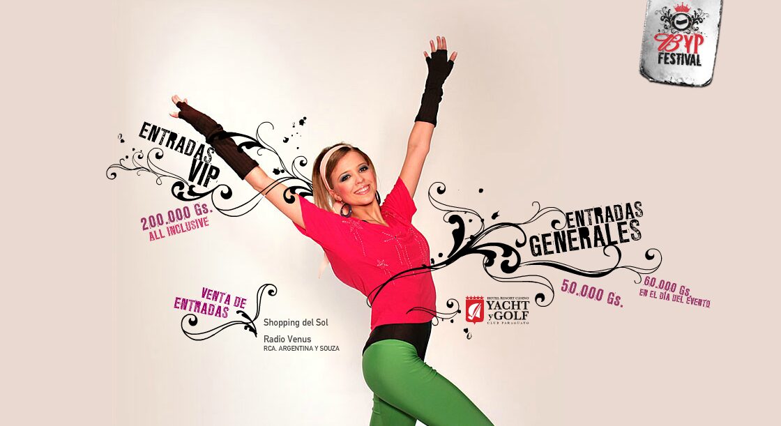
The whole visual system rests on two things: the photographic cut-outs, montaged one by one so the figures break out of the frame, and a white filigree that grows out of each figure and ends up writing its name. Colour goes in whole blocks —black for the rock acts, solid red for the models— so you know which section you are in without reading a word.
Sections
-
01
Line-up
One screen per artist.
-
02
Photos
Galleries by section.
-
03
Models
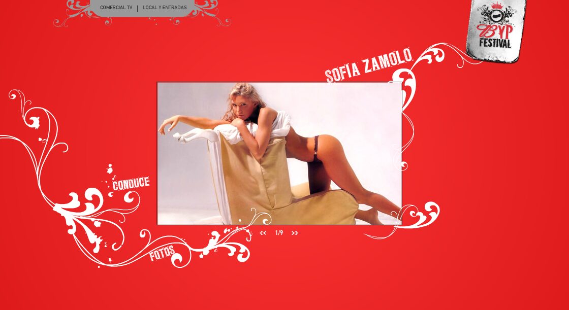
Modelos UP!, Las Chicas de Marce, Sofía Zámolo.
-
04
Music
Audio and video material.
Screens