Palermo "Unite"
Year Archive · offline
Client Cigarrillos Palermo — Tabacos del Paraguay S.A. / TABESA
Role Concept · UI/UX design · Illustration · Flash/ActionScript development
Stack Flash / ActionScript Ilustración a mano Comercial en FLV Galerías XML Wallpapers
Note: this is advertising work for a cigarette brand. This page documents the design and the development; it does not reproduce or continue the campaign's sales argument. The original pieces carry the mandatory health warning.
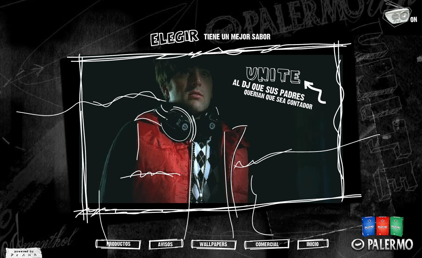
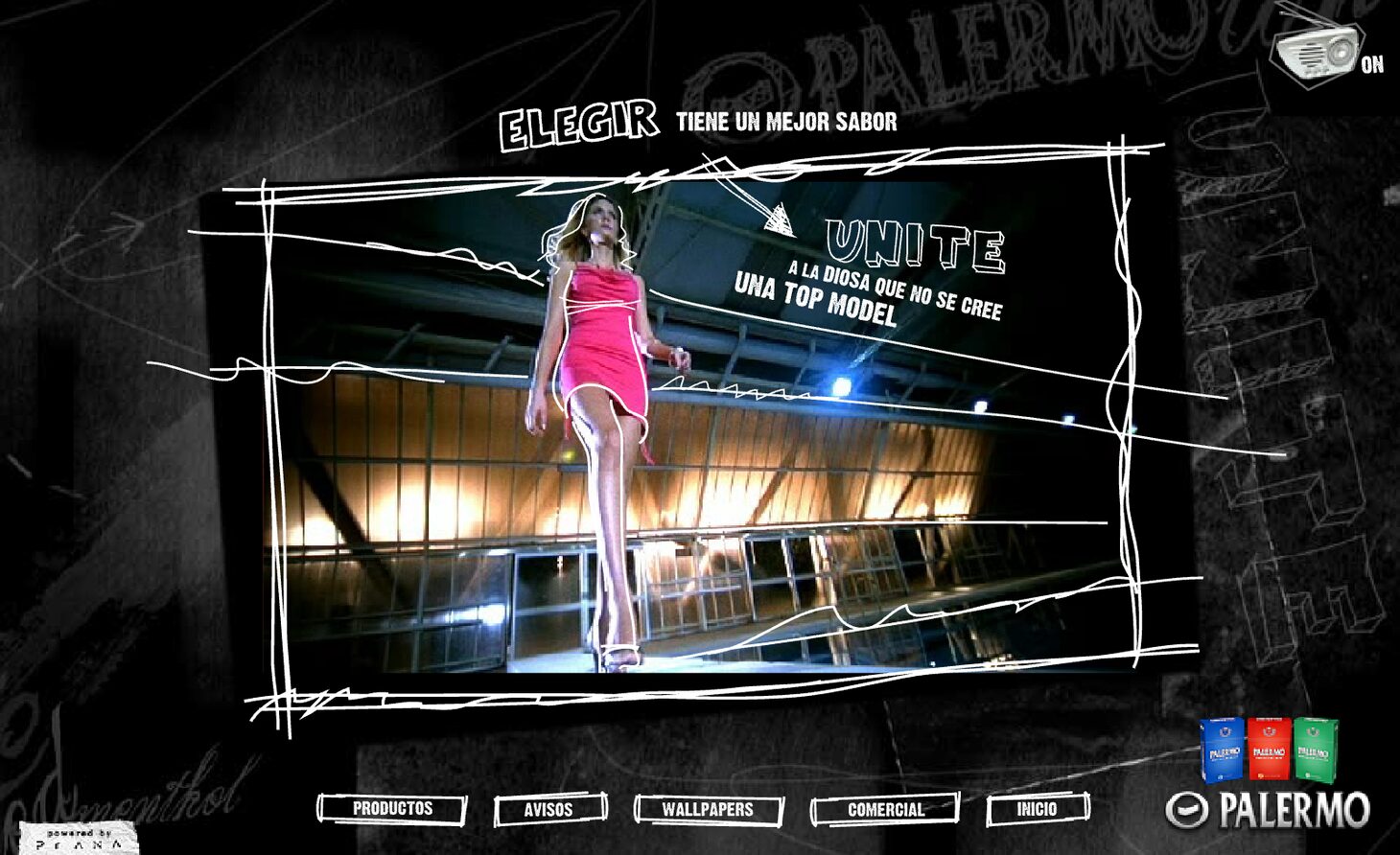
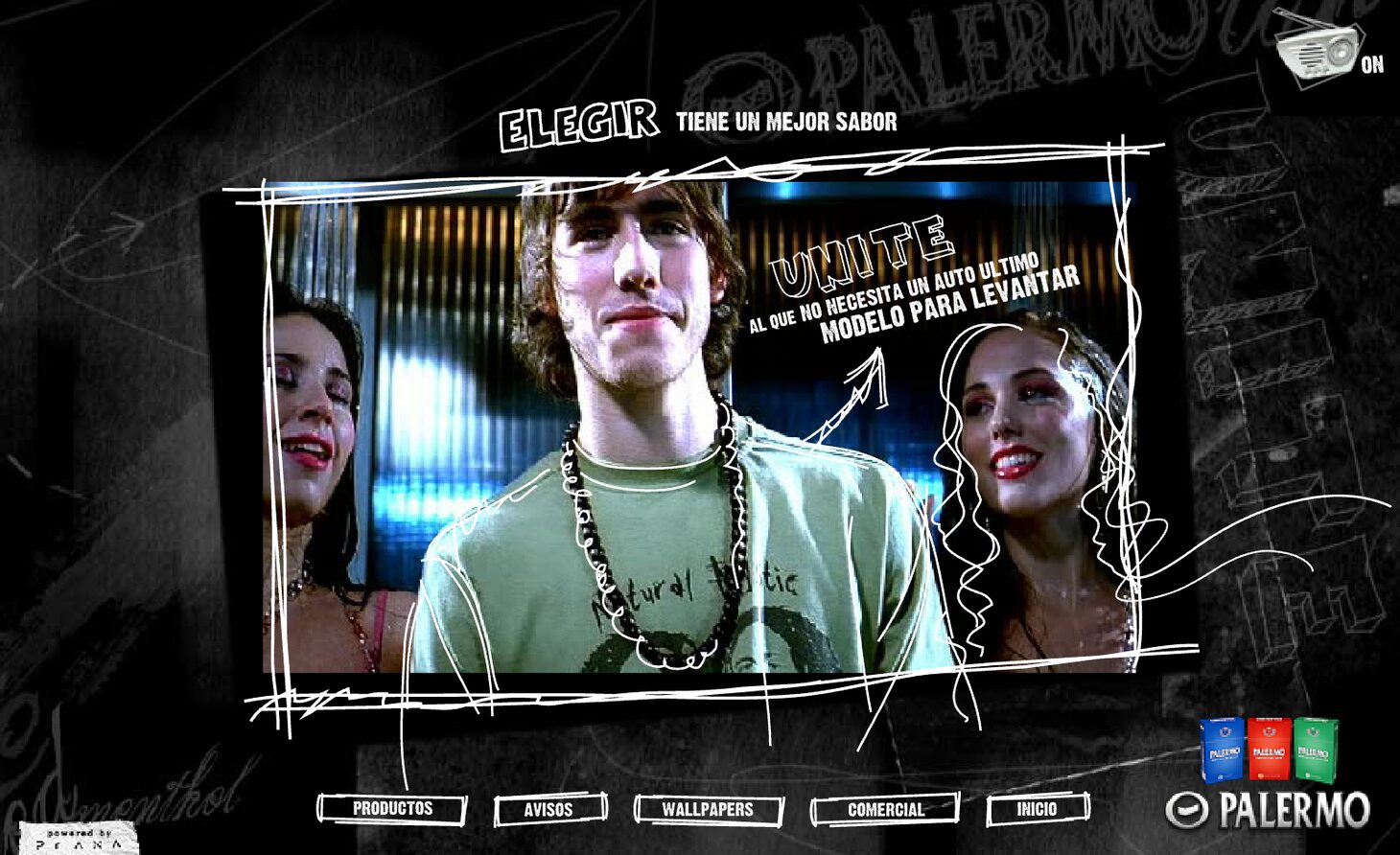
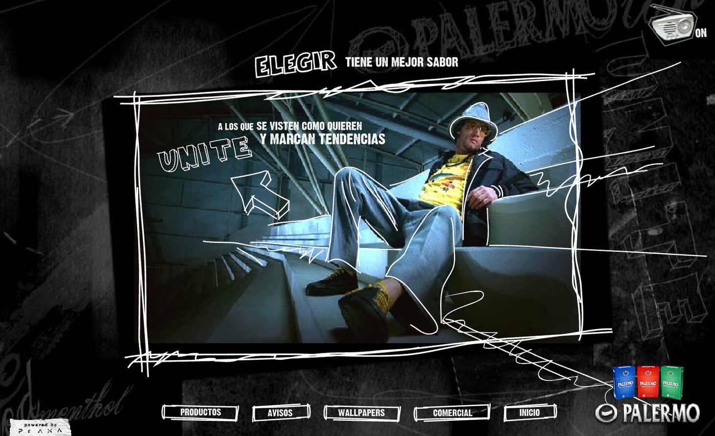
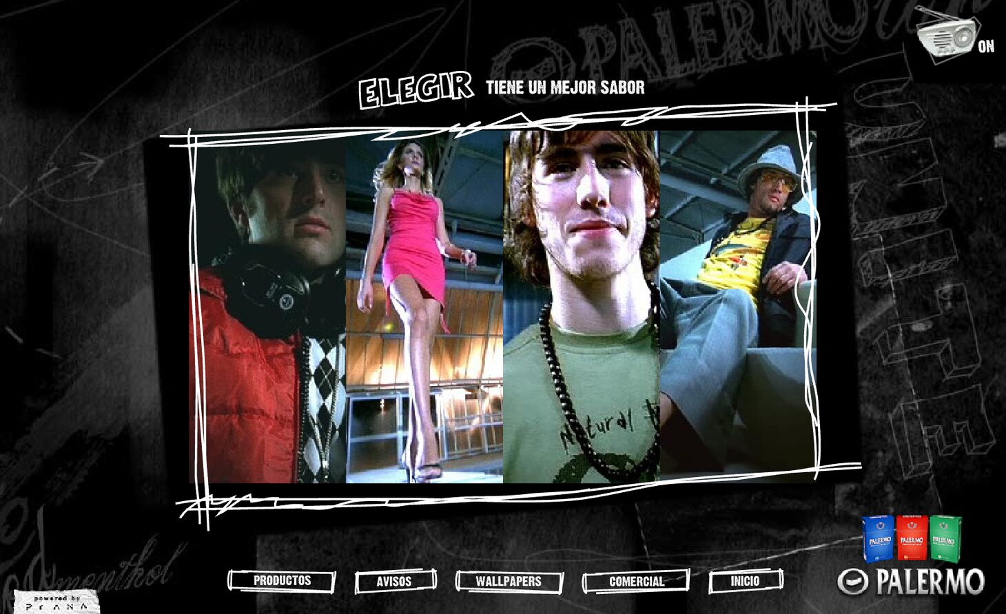
A marked-up wall: a dark ground with graffiti and overlaid strokes of the brand's own name, and on top of it a frame drawn by hand, its line shaky, holding four photographs in a strip. The navigation is five drawn labels along the bottom, like stencils.
Concept
This is a brand campaign site, and its problem is that it has to show four things —product, press ads, wallpapers, commercial— without looking like a catalogue. The answer is to treat the whole screen as a marked-up wall: the ground is a dark surface with layers of writing, the brand name repeated at different sizes, strokes, scratches and stains, like a wall painted over many times. On top of that, the content always sits inside a rectangle drawn freehand, its lines not quite closing at the corners and running past them.
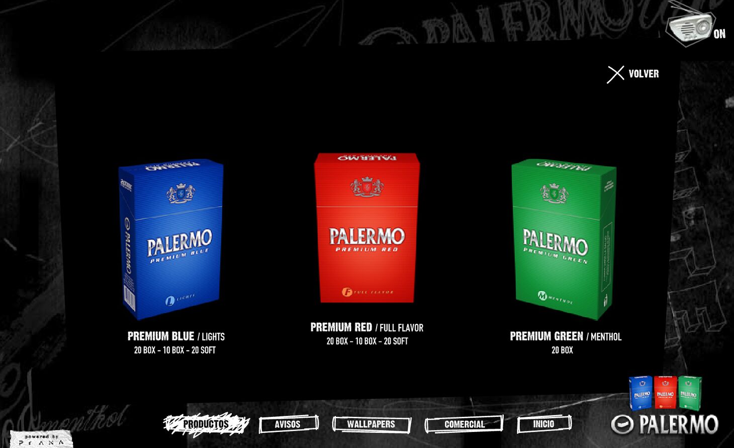
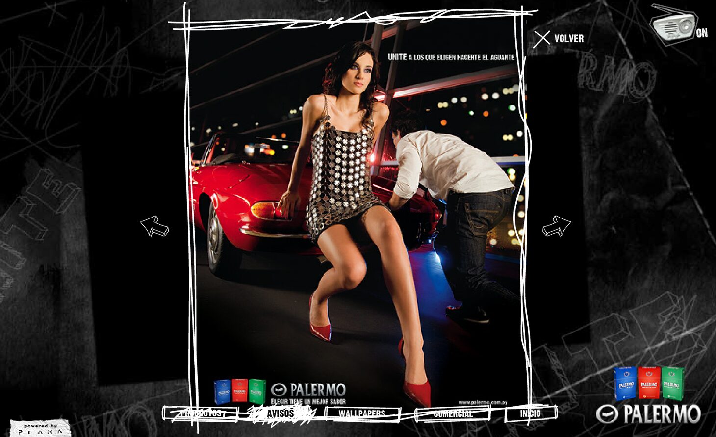
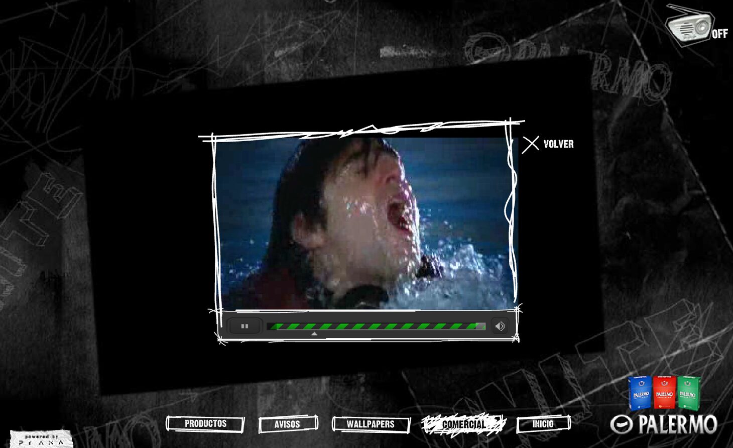
That frame is the central device and it turns up in every section: the home page uses it for the strip of four photographs, Press ads for the enlarged piece, Commercial for the video, which runs inside the same box with a progress bar made of little dashes. The container is always the same and what changes is what goes into it. The only section that drops the gesture is Products, which turns tidy: the three packs aligned on black with their details underneath. The freehand frame for everything expressive, the clean grid for the data.
And the four photographs in the strip are not there to be looked at: on hover, the photograph opens —growing out of its column until it fills the box across— the line that belongs to it comes in with a drawn arrow tying it to the person in the image, and the video clip of that scene starts. The whole campaign is right there: the photograph alone says nothing, the line alone would be a magazine ad, and the rollover is what joins them. The visitor discovers the message by moving the mouse instead of being served it.
Sections
-
01
Home
The wall and the strip of photographs.
-
02
Products
Premium Blue / Lights, Premium Red / Full Flavor, Premium Green / Menthol, with formats.
-
03
Press ads
The pieces, paged.
-
04
Wallpapers
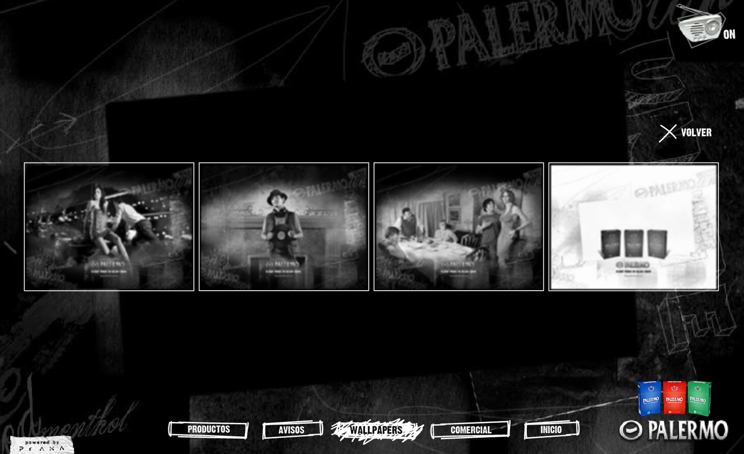
Four backgrounds.
-
05
Commercial
The TV film.
Screens